Recovering area shapes from anonymous contact tracing data
The actual COVID-19 pandemic has induced many governments to call for technological solutions for tracing contacts between people. Dozens of applications have been introduced so far, basically boiling down to five main frameworks: PEPP-PT, Google/Apple Privacy Preserving Tracing Project (GA-PPTP), DP-3T, Blue Trace and TCN; a detailed comparison between these approaches is outside the scope of this project (see e.g. here and here).
A common problem with all these approaches is the privacy of users: we would like to trace who has been in contact with an infected patient, without revealing their real positions and movements. This is even more important in centralized-based solutions (such as PEPP-PT), where tracing data is stored “in the cloud” or on servers run either by the Government or by some private institution.
To this end, several anonymization techniques are used; for instance, the “tags” that the apps exchange via Bluetooth, and eventually upload on the servers, are random-like strings like 387e07342c243b50a05da363f67e17ea25fe03bc, generated on a daily base (or more often) using hash functions. Even if these tags are calculated from some private/sensitive data (e.g. phone number, IMEI, Bluetooth MAC, GPS position), it is not possible to recover such data from the hash digest. In most protocols, no other information are exchanged between apps nor are uploaded to servers. Thus the user identity cannot be associated to tags. (In centralized solutions, however, the central service may geolocalize a device when the tracing app connects to the server, either for uploading its tags or for collecting the tags that new positive patients have uploaded.)
Now, a natural question arises: can some sensible geographic information leak, even adopting strong anonymization techniques? In this exercise we will see that the answer is: yes. More precisely, we will see that from a (dense enough) set of anonymous contact trace data we can reconstruct (quite precisely) the geometric shape of the area from where the data come from. (And notice that this contact trace data can be easily collected in centralized contact tracing solution, while it would be much more difficult with truly distributed ones.)
Proximity graphs
The kind of datasets we consider are relations between users, or points, defined by their “contacts”; in the case of tracing apps, two points are related iff they have been close enough to exhange their anonymous tags. For instance, let us consider ten points randomly scattered on a 1000x1000 area:
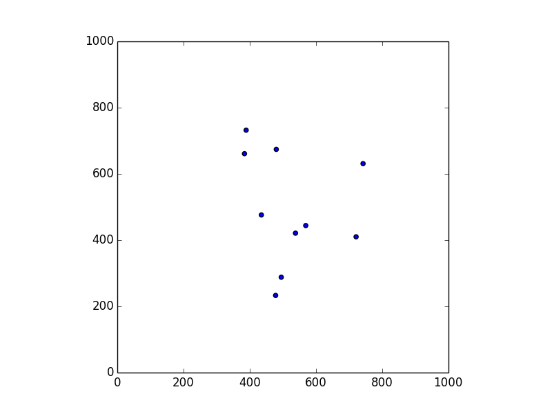
The corresponding relation can be represented as a undirected graph, which we call proximity graph. We will describe these graphs using the common dot notation. Hence, for a “proximity radius” of 100, the dot file corresponding to the map above is:
graph G {
layout = sfdp;
node [shape=point];
0;
1;
2;
3;
4;
5;
6;
7 -- 3;
7 -- 4;
8 -- 6;
9 -- 2;
}
This is the kind of information that we can recover by observing the exchanged tags only. In fact, as we can see, all geometric (geographic) information is lost. These graphs can be drawn using a tool like graphviz:
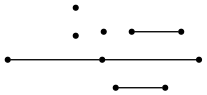
and we can see that there is no resemblance between the proximity graph and the original map.
So, our privacy is preserved: points are anonymous, and geographic information are lost. Or maybe not? What happens when we move from this small example, to something more real?
Increasing density
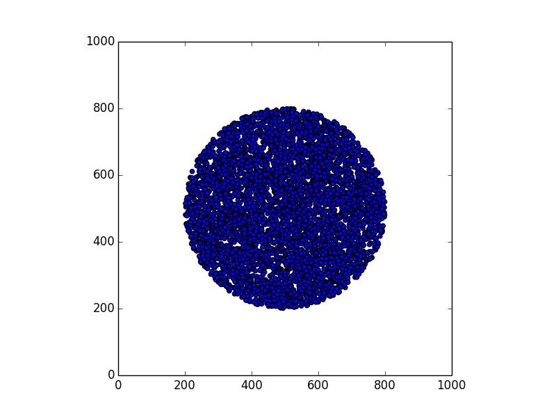
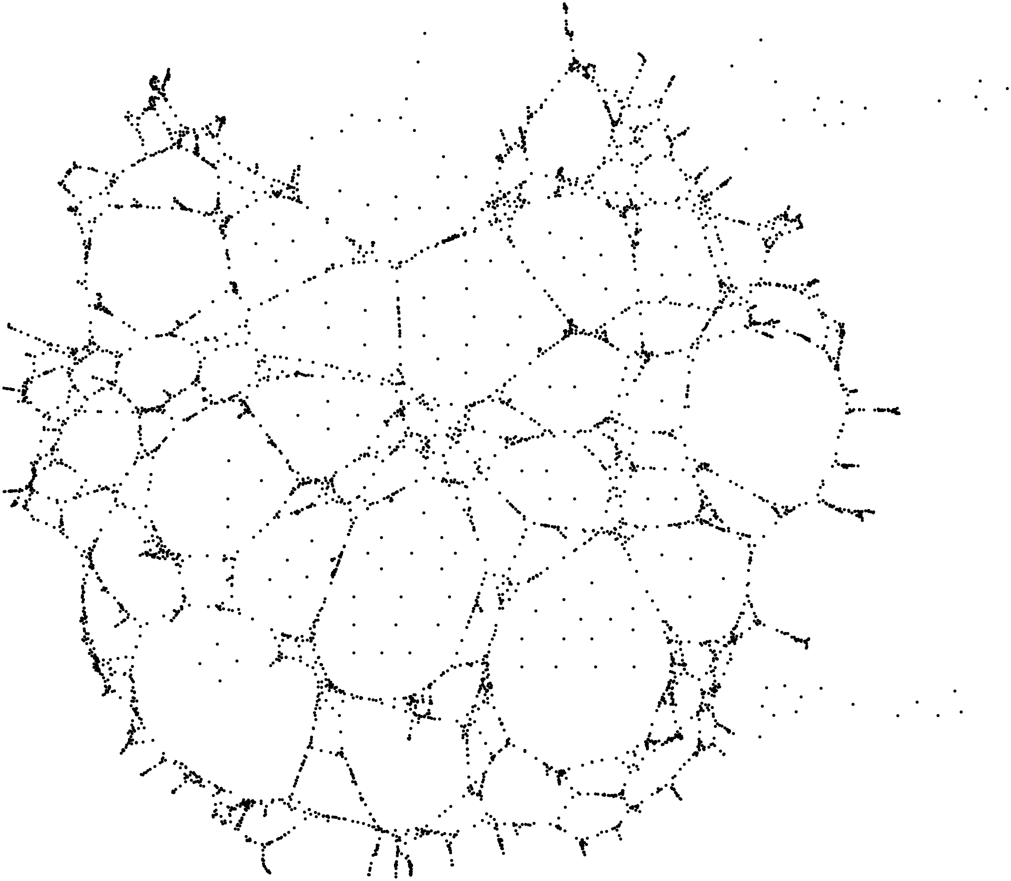
In this section we consider the case of 15.000 points (corresponding to 15.000 devices), scattered on an area inside a square of 1000x1000 units (a unit can be 1 meter, for instance). The shape of the area can be anything: a circle, a rectangle, a city center, a region, etc.
Given a shape, we
- generate a random map of 15.000 points within that shape
- derive the proximity graph for these points, with a proximity distance of 10 units (Bluetooth can easily connect over 10 meters in absence of obstacles). Of course, in the proximity graph all coordinates and distance information are lost.
- plot the proximity graph using a multi-scale force-directed model (
sfdp, in graphviz). Basically, connections are seen as ``springs’’, so that connected points are drawn closer to each other. (Edges are not drawn, otherwise we would just see an almost uniform black blob.) - compare the resulting plot with the original shape.
Here are some examples.
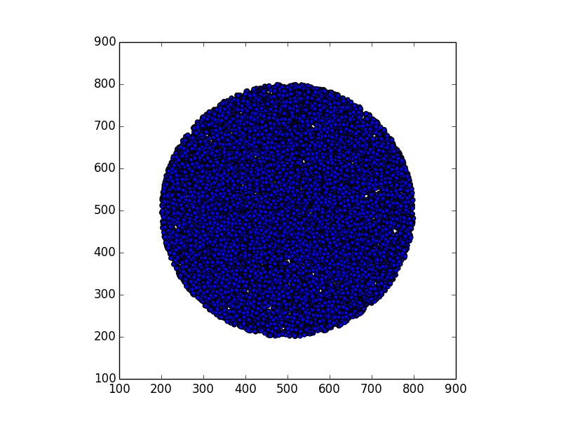
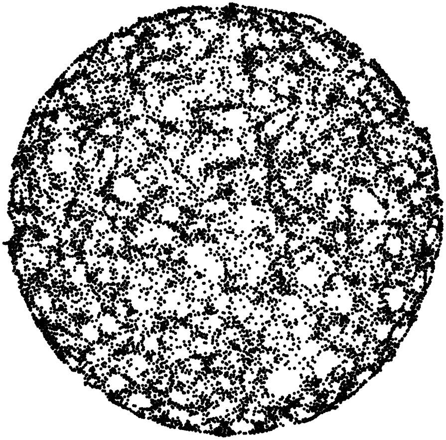
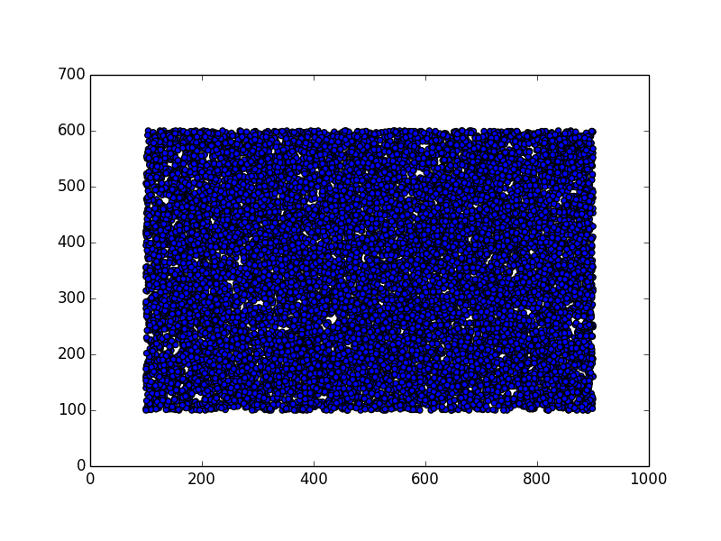
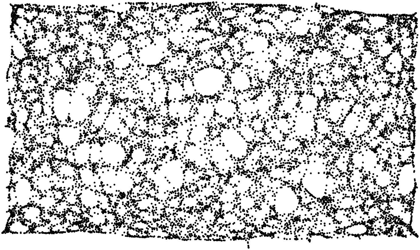
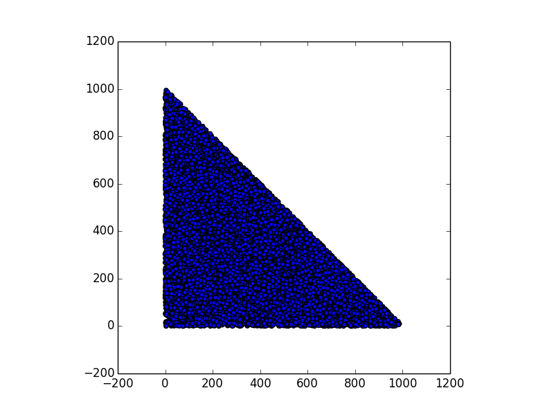
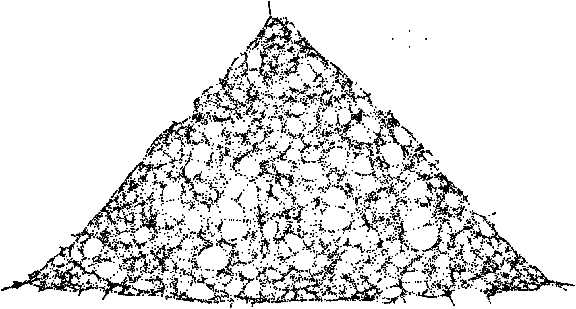
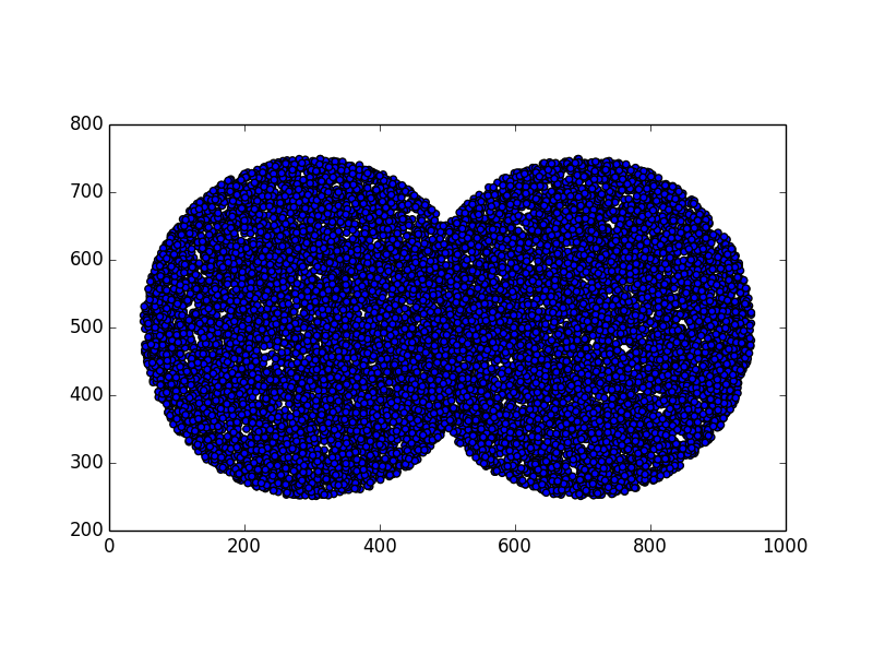
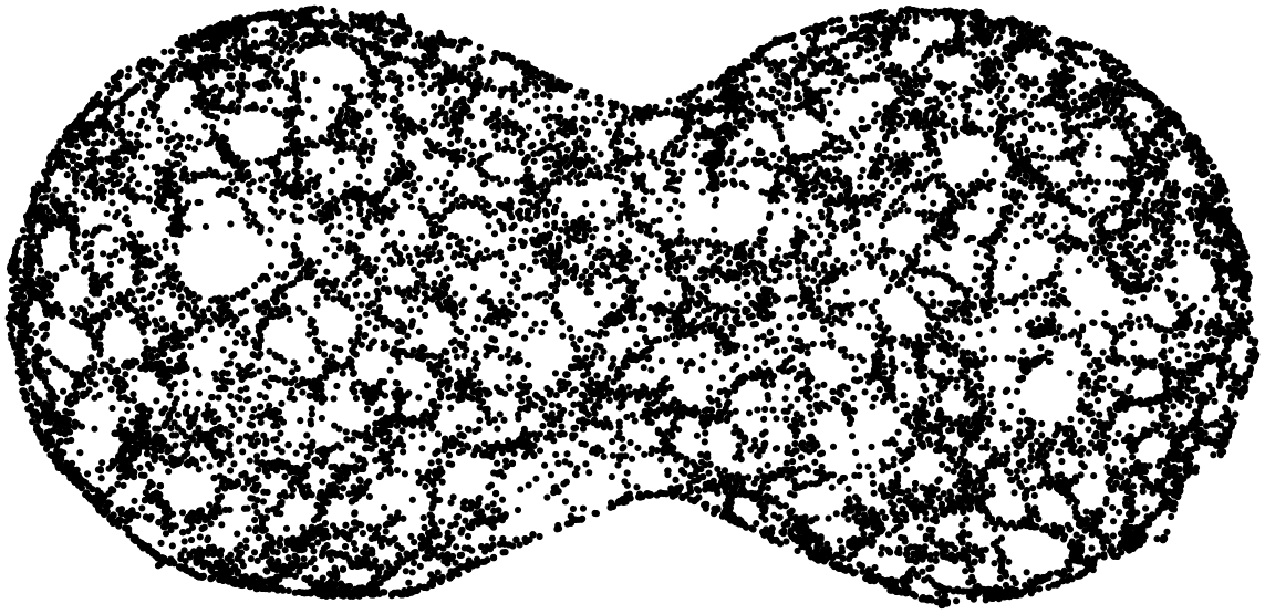
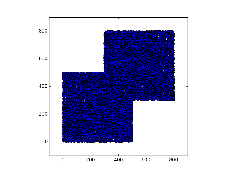
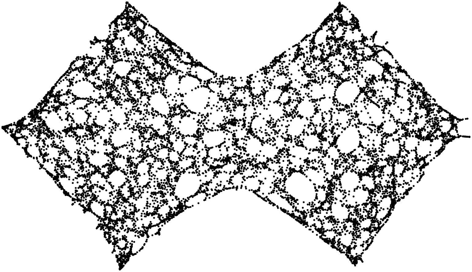
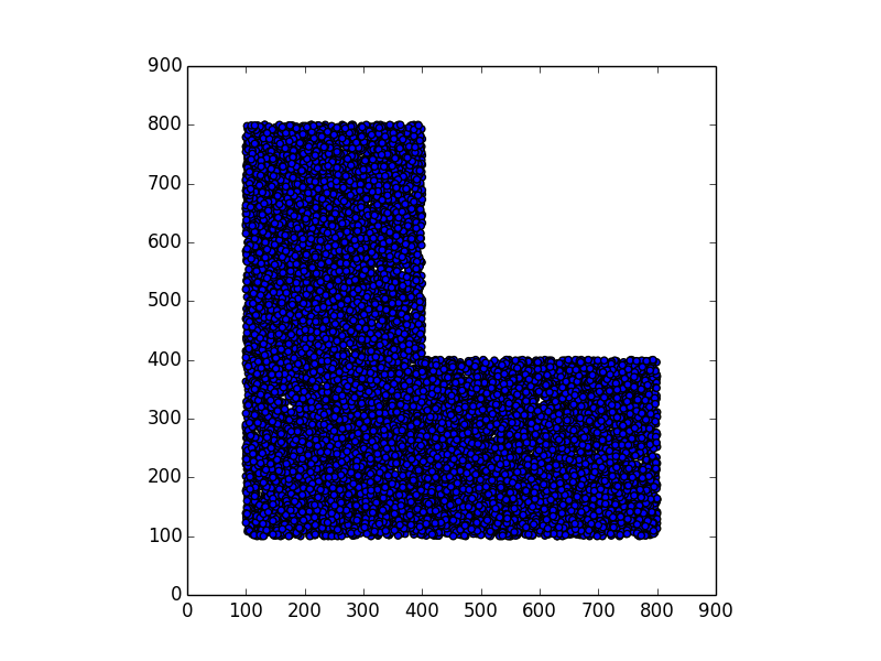
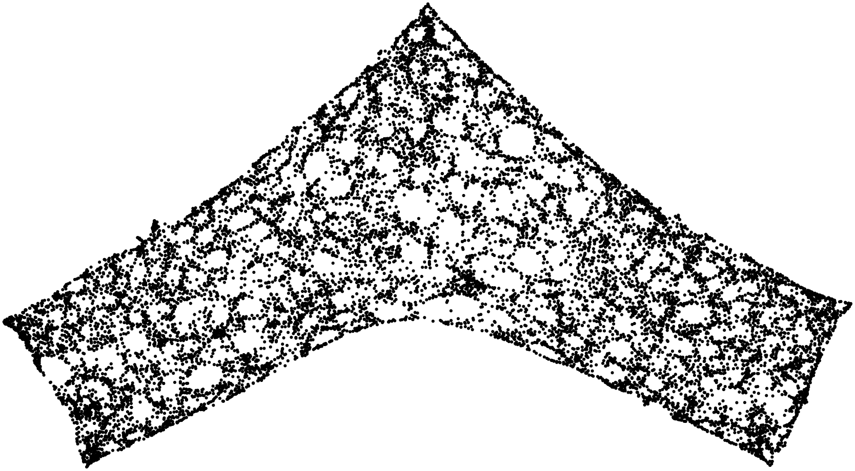
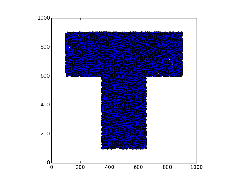
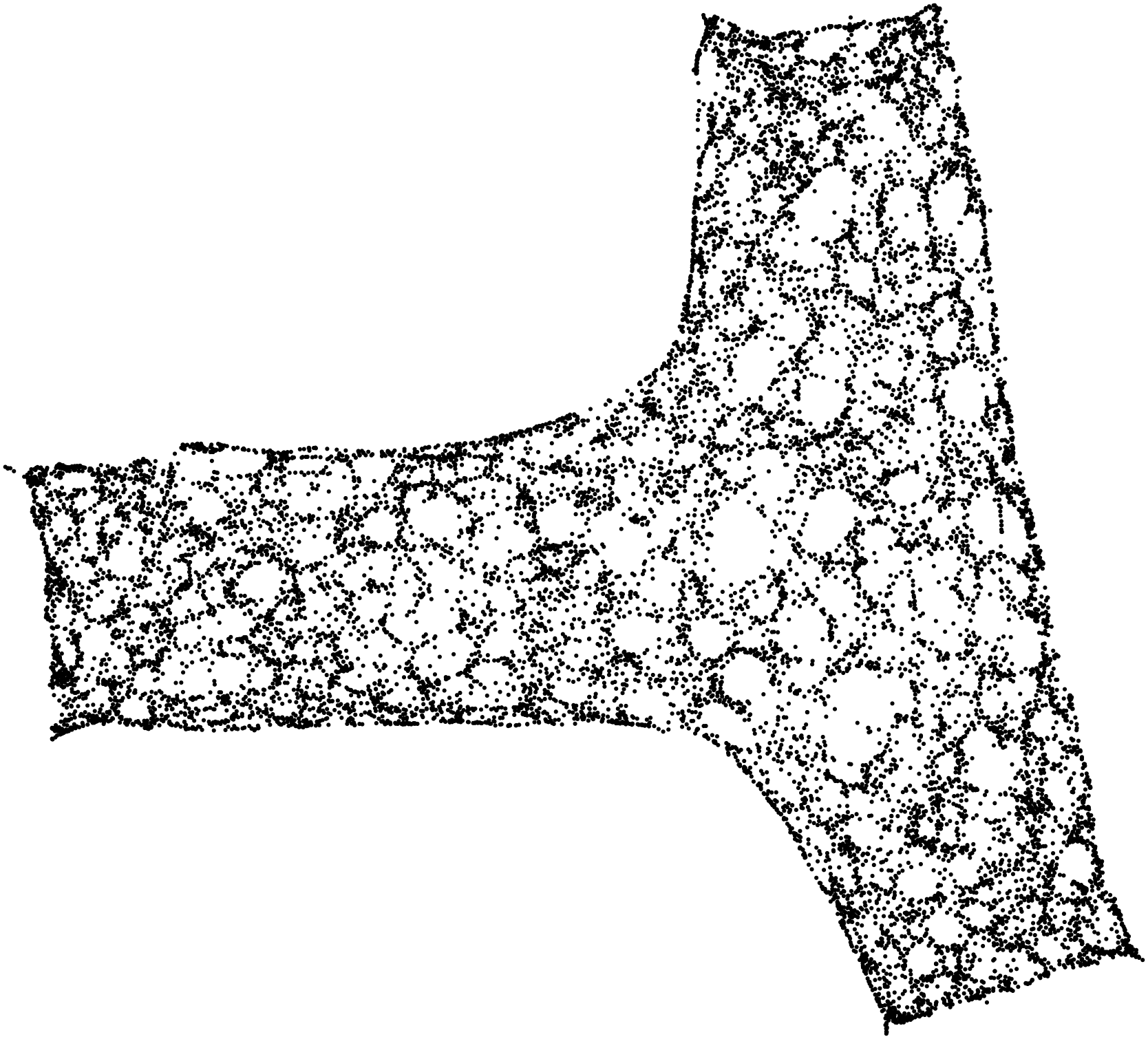
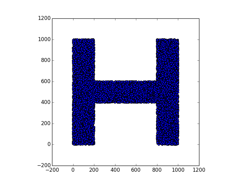
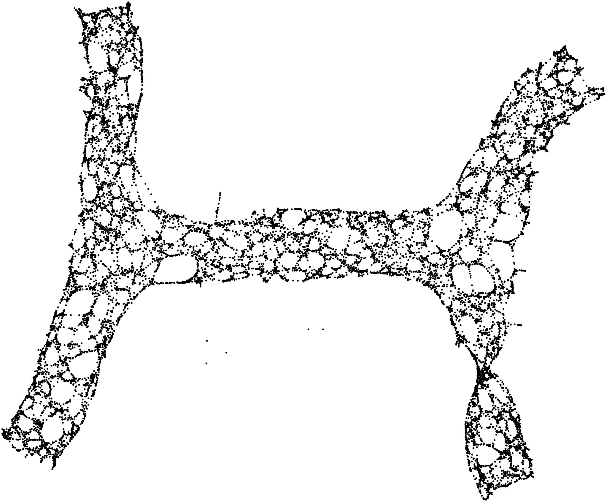
Stunning resemblance, isn’t it?
Of course, the results may be not so close if the density is not high enough, or the proximity distance is too low. For instance, this is a result with 5000 points (and proximity distance still equal to 10):
Moreover, we have assumed that the points do not move. A “moving” point would play havoc in the model, creating lots of connections in different locations at different times.
Conclusions
In this exercise we have seen that an anonymized proximity graph can contain enough information to reproduce the geometry of the area where the data came from. No geometric / GPS / geolocation / distance information is needed: the contact information will suffice.
Once a map is obtained in this way, it can be laid over the actual map of the area of origin (e.g. using Google Maps). Thus, the (anonymous) points can be given an actual position. Accuracy of the result depends on the number of points (devices), and the proximity distance.
It should be observed that in order to construct the proximity graph we need to collect exchanged tags in a centralised server. This can be achieved quite easily with centralized contact tracing solution, while it would be much more difficult with truly distributed ones.
The analysis we have carried out in this small example is still primitive, and based on very limited techniques and tools. After all, I’m no big data expert :) More sophisticated techniques could be used in order to achieve a similar result, even in presence of limited data. Further improvements can be obtained by taking advantage of extra information, not included in the proximity graph, such as: “pinned points” (i.e., points whose coordinates are known), population distribution on the area, etc.
Appendix: how to produce these pictures
- Requirements: python and graphviz.
- Download the script generate.py.
- Execute
python generate.py > out.dotThis generates also a filemap.png, containing the original map of random points. - Execute
dot -Tpng out.dot -o plot.png. This generates the reconstructed map. - Compare
map.pngandplot.png:)
Parameters are hardcoded in the script (sorry), but easily tweakable:
- AREASIDE = Side length of the area
- NUMPOINTS = number of points to generate
- DISTANCE = proximity distance
- filter() = defines the shape of the area. Some shapes are already define, others can be added easily.
Enjoy!